Understand Isomer's design
Learn about what's available on Isomer and get tips on building a website.
Link your pages using cards
This is an optional description


Showcase metrics for your agency
100
You could add a number
+10%
A percentage
S$2,000
Or a monetary value
Highlight an ongoing campaign
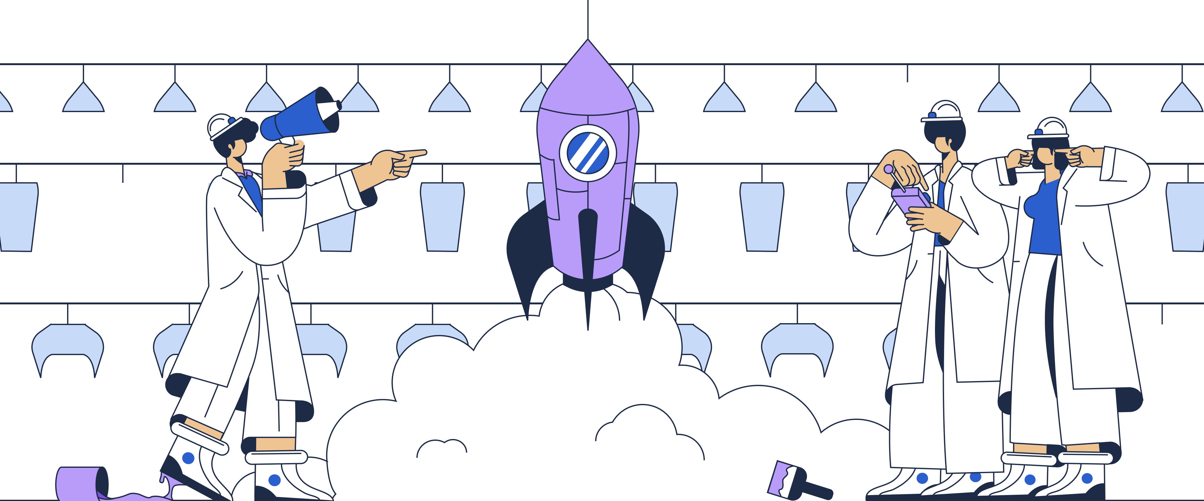
Use an authentic, human image to show what your campaign is about

Or, talk about your agency's mission
You might explore highlighting a key value here
Link pages using icons and text
This is an optional description
You can add a quote or testimonial that talks about your agency— Add a source

Get conversions with a strong Call-to-Action
This is an optional description
Looking for more tips? Read our blog
We share why we design things the way we do and tips for building better websites.